

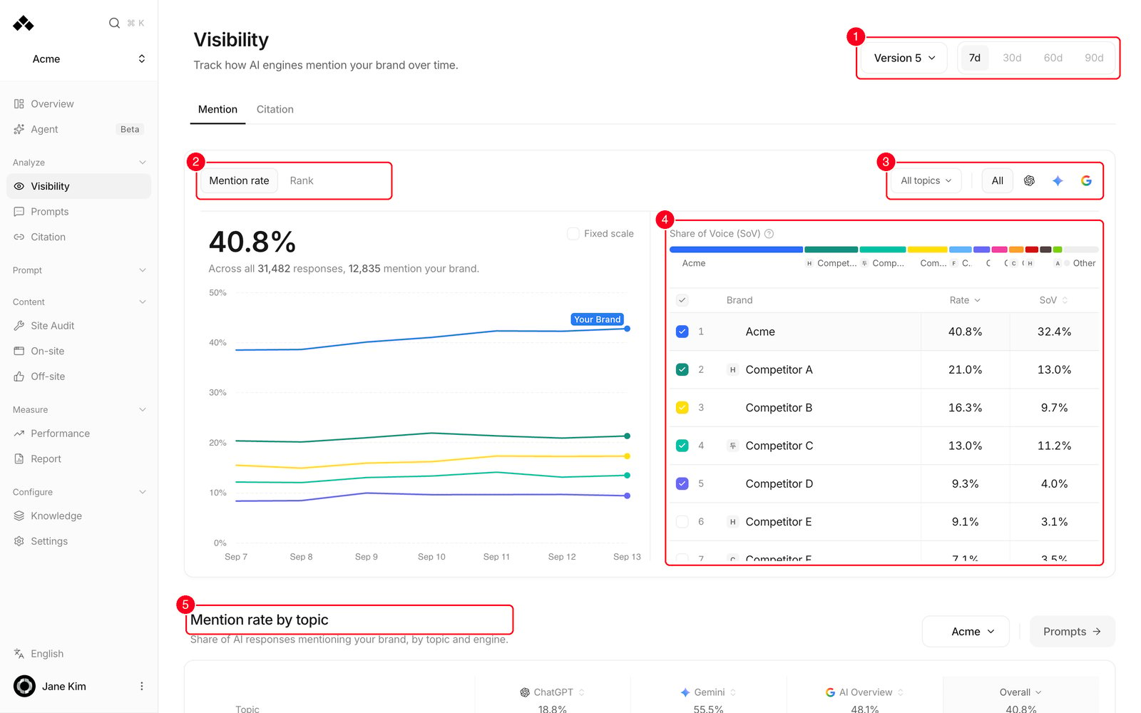
- Header controls — region, prompt panel version and period (7d / 30d / 60d / 90d), with the Mention · Citation tabs under the title.
- Metric toggle — switch the card between Mention rate and Rank.
- Topic filter and engine filter — narrow the card to chosen topics, or to one AI engine.
- Scoreboard — every tracked brand with its figures; the checkboxes choose who is drawn on the chart.
- Mention rate by topic — a topic-by-engine grid that shows where you’re strong and where you’re missing.
What’s on the screen
The controls at the top
Select a retired version and the period picker is replaced by a Full version history chip — that version’s window is the whole era it was live for, so 7/30/60/90 doesn’t apply.
The top card: overall mentions
The big number on the left is your Mention rate (say, 34.2%) or your Mention rank (say, #2.4). The badge next to it compares this period against the immediately preceding window of the same length — on 7d, the 7 days before it. The line underneath tells you the denominator: “Share of AI responses that mention your brand” with the counts behind it. The trend chart shows day by day movement inside the window.- The chart draws the brands ticked in the scoreboard. Until you pick, that is you plus your 4 strongest competitors at the current scope.
- The Fixed scale checkbox pins the vertical axis to 0–100% instead of zooming to the data band. It doesn’t apply to rank.
- A dashed vertical line marks a day your setup changed. Hover it for the reason, such as Prompt panel version changed, competitors added or removed, or competitor aliases updated.
- A day whose answers are still being collected shows no point. Hover it to read Score unavailable · [collected]/[expected] collected and whether collection is Recovering or Collection incomplete.
The scoreboard
On the right is the brand list: you first, then every tracked competitor.- The checkbox in each row draws that brand on the chart; the checkbox in the header ticks or clears them all.
- On mention rate the columns are Rate and SoV; on rank they are Rank and #1 share. Click a column header to sort.
- On mention rate the Share of Voice (SoV) bar sits above the list.
- Click a brand’s name to drill into that brand’s topics (below). The chart focuses on that brand while you’re in there.
Share of Voice (SoV)
In plain words: how much of the brand conversation inside AI answers is yours. It doesn’t just count mentions — it weights each one by how early you’re named (a mention near the top counts for much more) and how much of the answer is about you (a paragraph beats a passing line). That total is divided by the same figure for you plus every tracked competitor, which is why the SoV column adds up to 100% across the scoreboard. On the bar, any brand at 2% or less is rolled into a grey Other segment — their individual numbers are still in the table.Mention rate by topic
This card is a grid: one row per topic, one column per AI engine, and each cell is the share of that engine’s answers on that topic which mention the selected brand. Its subtitle reads “Share of AI responses mentioning your brand, by topic and engine.”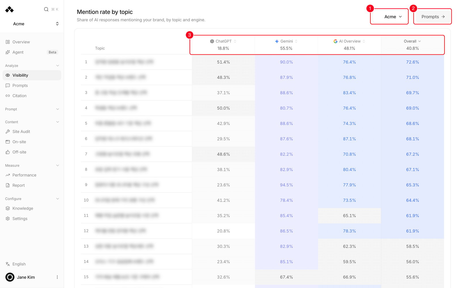
- Brand picker — the picker in the card’s top right chooses whose rates fill the grid. It starts on you; pick a competitor to see the same grid for them, tinted in their colour. The picker has a search box.
- Prompts → — takes you to the prompts behind these topics.
- Engine columns and Overall — one column per AI engine, with an Overall column on the right giving each topic across every engine. An Overall row at the bottom gives each engine across every topic; the corner is the all-topics, all-engines figure. Click a column header to sort by that engine — #1 is always the strongest row.
The Citation tab
The Citations card counts the source links AI answers leaned on. The big number is the citation count, with Citations from [n] responses · [x]% owned, [y]% earned under it. Owned means the source sits on one of your own domains; Earned is everything else.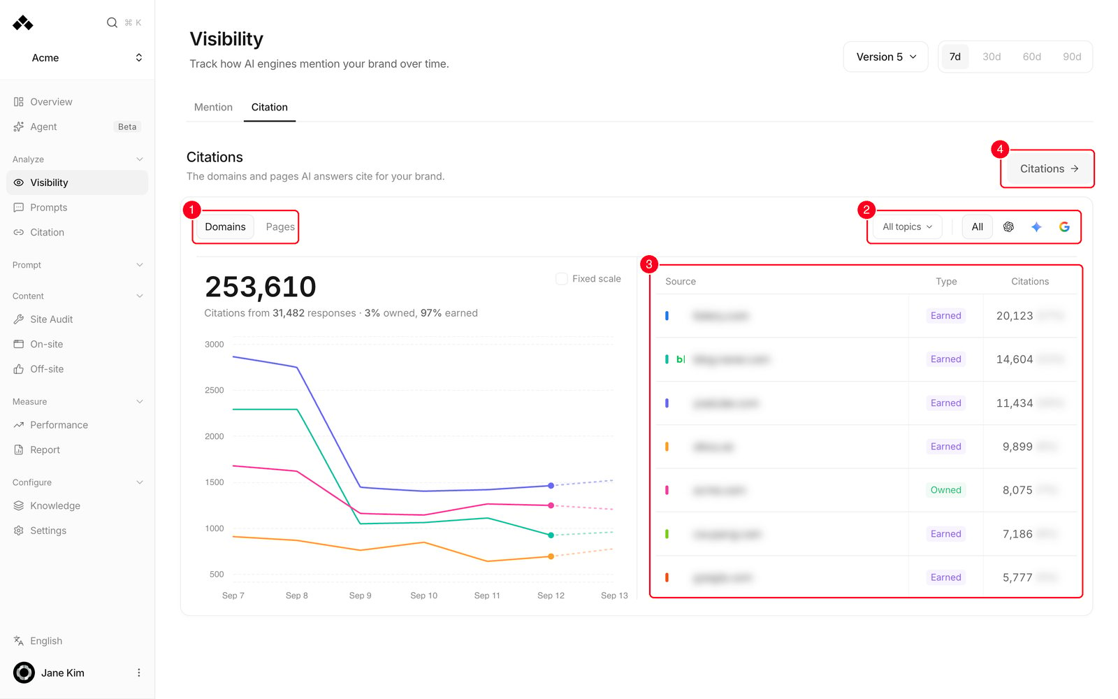
- Domains / Pages — switch the table between whole sites and individual URLs.
- Topic and engine filters — the card has its own All topics filter and engine toggle.
- Source table — up to 7 rows with Source, Type and Citations. A source that first appeared in the second half of the window gets a New tag.
- Citations → — opens the full Citation screen.
Reading the numbers
A few things worth knowing:
- If your brand appears several times in one answer, mention rate still counts it once.
- A prompt that literally names your brand is weighted down to 10%, so “is Acme any good?” can’t inflate your numbers. The topic grid excludes branded and comparison prompts entirely.
- Mention rank compares you against every brand the answer named, including ones you don’t track — so a brand that never shows on the scoreboard can still push your rank down. SoV counts tracked competitors only.
- If the previous window has no measurement at all, the change badge shows — rather than 0. “Not measured” isn’t “flat”.
- SoV and #1 share carry no change badge.
- In the brand detail, a topic marked “Measured, but outside the top 8 in this topic” has a figure that didn’t make that topic’s leaderboard.
How the data is collected
Your prompts are asked once a day, at the hour set for your workspace, of every engine your plan measures. The engine icons on the page are exactly the engines with data in the selected window. The platform supports ChatGPT, Google AI Overview, Google AI Mode, Gemini, Perplexity, Grok, Copilot, Naver AI Tab, Naver AI Brief, DeepSeek and Amazon Rufus. When Google AI Overview is unavailable or fails, an AI Mode answer is used for that Overview measurement. Measurements with Google AI Mode selected separately remain separate. Competitors come from two places: the ones you add yourself, and the ones found in AI answers. Discovery runs on your first analysis and then roughly monthly, and keeps up to 20. A competitor that stops appearing is set aside rather than deleted, so its history survives if it comes back.How to use it
1
Weekly check
Leave the period on 7d, read the big number and its change badge, and glance at the Share of Voice (SoV) bar. Then scan the topic grid for cells that went pale.
2
Find who's beating you
Click Rate in the scoreboard header to sort, then click the top competitor’s name. Their topic table opens with Your rate beside each of their figures; Competitor lead lists only the topics where they win.
3
Compare engines
Use the engine toggle on the overall card to scope the number and chart to one engine, or read the Overall row of the topic grid to compare engines side by side.
4
Find topics to work on
In Mention rate by topic, sort by the engine you care about and look at the bottom rows, then switch the brand picker to your strongest competitor to see where they cover what you don’t. Prompts → takes you to the questions behind it.
FAQ
What does the change badge next to the big number compare against?
What does the change badge next to the big number compare against?
The immediately preceding window of the same length — on 7d, the previous 7 days. If there’s no measurement in that prior window, the badge is left blank rather than showing 0.
Where did the Insights panel go?
Where did the Insights panel go?
It’s been retired. The topic grid and the brand detail cover the same questions: which engine is weak, which competitor is ahead, and where. For the actual answers, go to Mentions.
My mention rate dropped right after a prompt panel change.
My mention rate dropped right after a prompt panel change.
A new version asks different questions, so the denominator changed — it isn’t the same measurement. That’s why the page scopes to one version at a time, and why the chart marks the day with a Prompt panel version changed tooltip. Compare within a version.
My mention rate is high but my SoV is low. Why?
My mention rate is high but my SoV is low. Why?
Mention rate counts how often you appear. SoV measures how much of the brand conversation is yours. If you’re always named last in a single line while a rival gets a paragraph up top, you can have a high rate and a low SoV.
A brand I keep seeing in answers isn't on the scoreboard.
A brand I keep seeing in answers isn't on the scoreboard.
It isn’t tracked. Untracked brands still sit in the ranking pool and can push your mention rank down, but they contribute nothing to SoV and get no row. Add it as a competitor in settings to bring it in.
Why are the heatmap colours different from last week?
Why are the heatmap colours different from last week?
The bands are fitted to the numbers on screen, so the darkest shade always marks your best cells. Read the legend for the actual cut-offs, and use the figures rather than the colour when comparing two weeks.
Related
Mentions
Read the actual AI answers behind these numbers.
Citation
See every domain and page AI answers cite.
Prompts
Review and edit the questions being measured.
Reading the numbers
Which metric answers which question.